Building Canada’s National Hub for IPV-Related Brain Injury
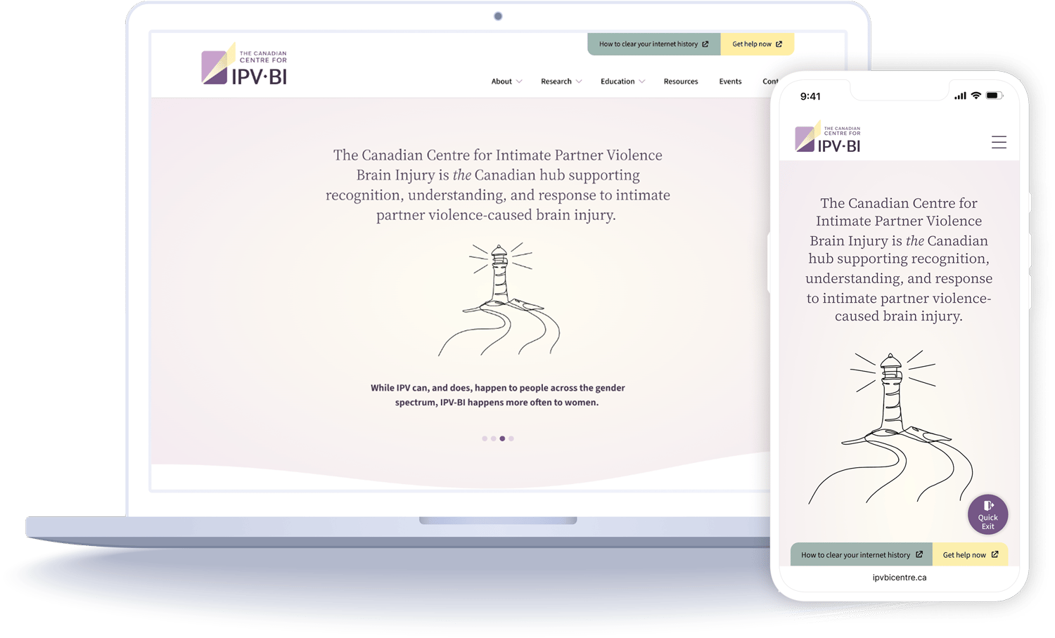
Professionals working at the often unrecognized intersection of intimate partner violence and brain injury had nowhere to find shared resources, or each other. I led the design of a national website to serve as the much-needed resource hub and community network to fill those gaps.

Client • Studio
IPV-BI CentrePivot Design Group
Role
Lead UX & Visual Designer
Scope
Product strategy, Brand identity, IxD, UI design
Team
Two designers + one developer
Built to sustain
Community features sized to the reality of the client’s staff and budget
Trusted partner
Multiple projects with the project lead over 8 years
23,000+ users
Reached by the ABI Toolkit, an earlier project that made the case for the Centre—where I was also design lead
The Problem
A hidden crisis, with no place to gather.
Brain injury (BI) caused by intimate partner violence (IPV) often goes unrecognized. Resources were scattered and professionals had no network, so survivors weren’t getting the care they needed and research wasn’t moving forward.

01
Three very different audiences
Researchers, professionals working on the frontlines, and survivors each needed something different from one site.
02
An ambitious brief
The client wanted a moderated forum and a global directory of experts, but had no staff or budget to run them.
03
Users who may be in danger
Survivors might visit on a monitored device, so safety had to be built into every page.
The Approach
Defining the product
01
Starting from proven user needs
Having led the research and design on the ABI Toolkit, I was able to bring learnings forward from the survivor and frontline-worker personas and journey maps into this project, so we started from needs we’d already validated.
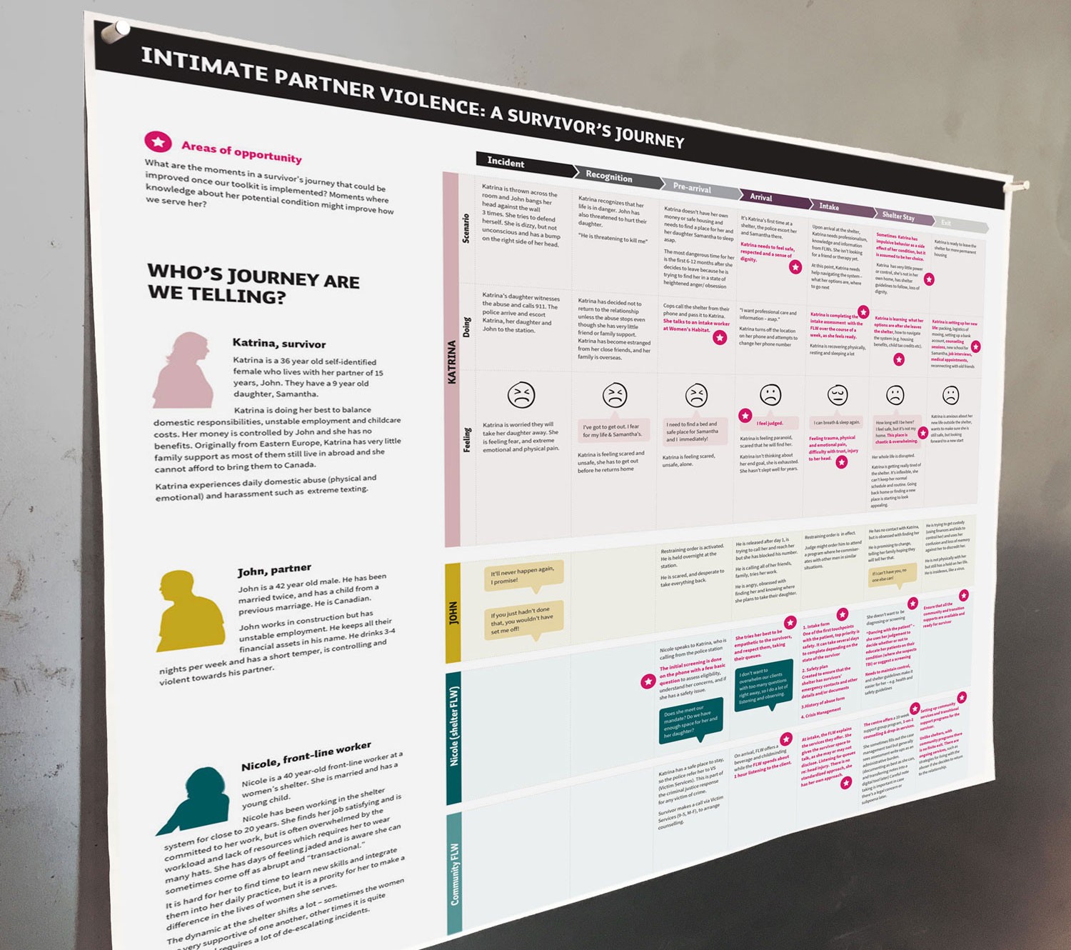
Survivor & front-line worker journey map from the ABI Toolkit
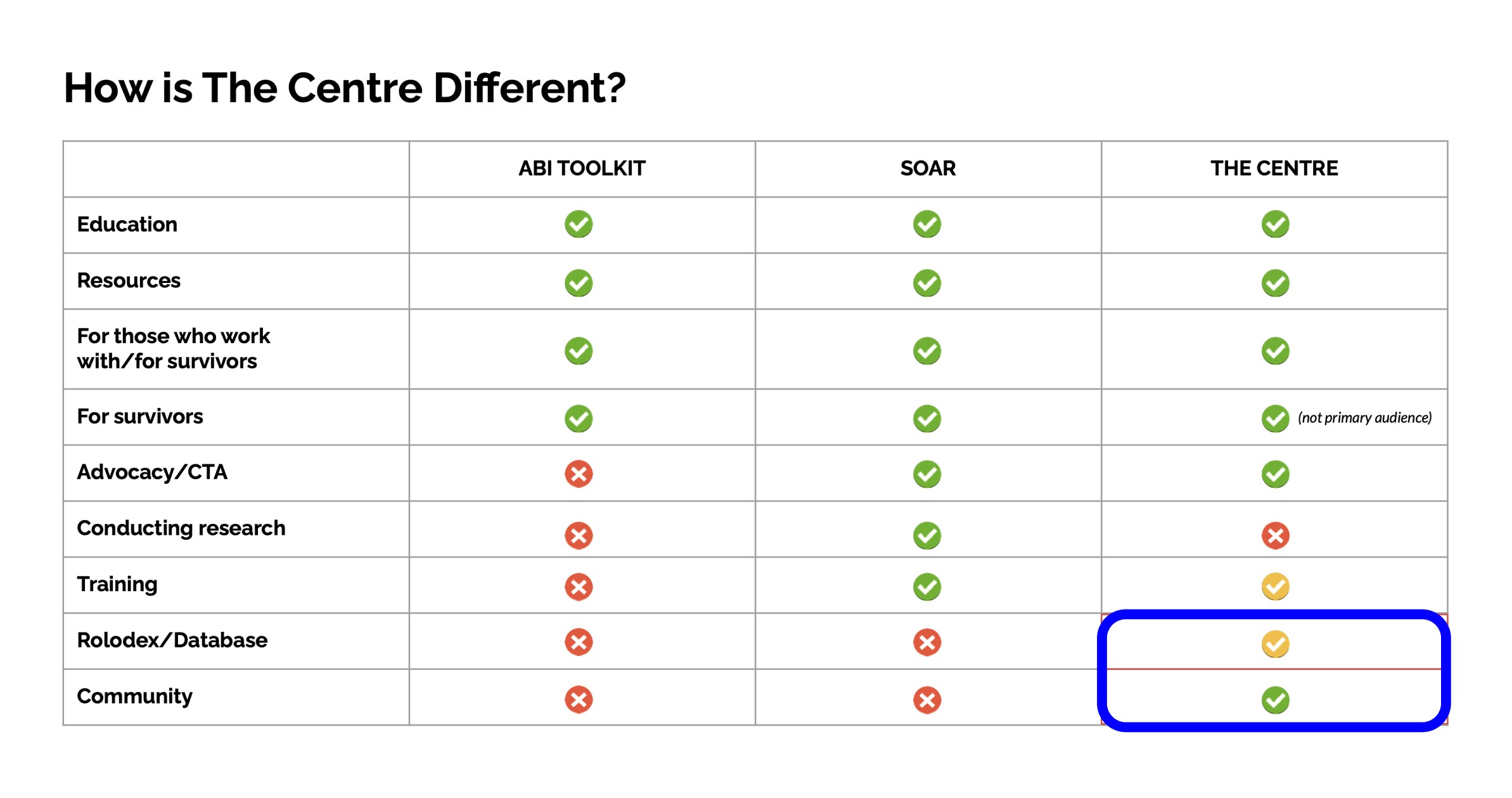
Comparing services to define the Centre’s value and purpose
02
Defining the value proposition
I mapped the Centre against partner organizations to identify where it offered value to its professional audience. Only the Centre could offer a community network, making this our guiding direction and also the hardest to deliver within the Centre’s budget.
03
Ambitious brief vs. operational reality
The initial brief called for an active online community featuring moderated forums and a "global Rolodex" of experts, requiring staff the client didn’t have, and in this field an unmoderated forum could be a real risk.
I proposed a “Bulletin Board” model instead. Dedicated pages showcase existing networks and recurring activities and invite people to join, so the site delivers community without live moderation.
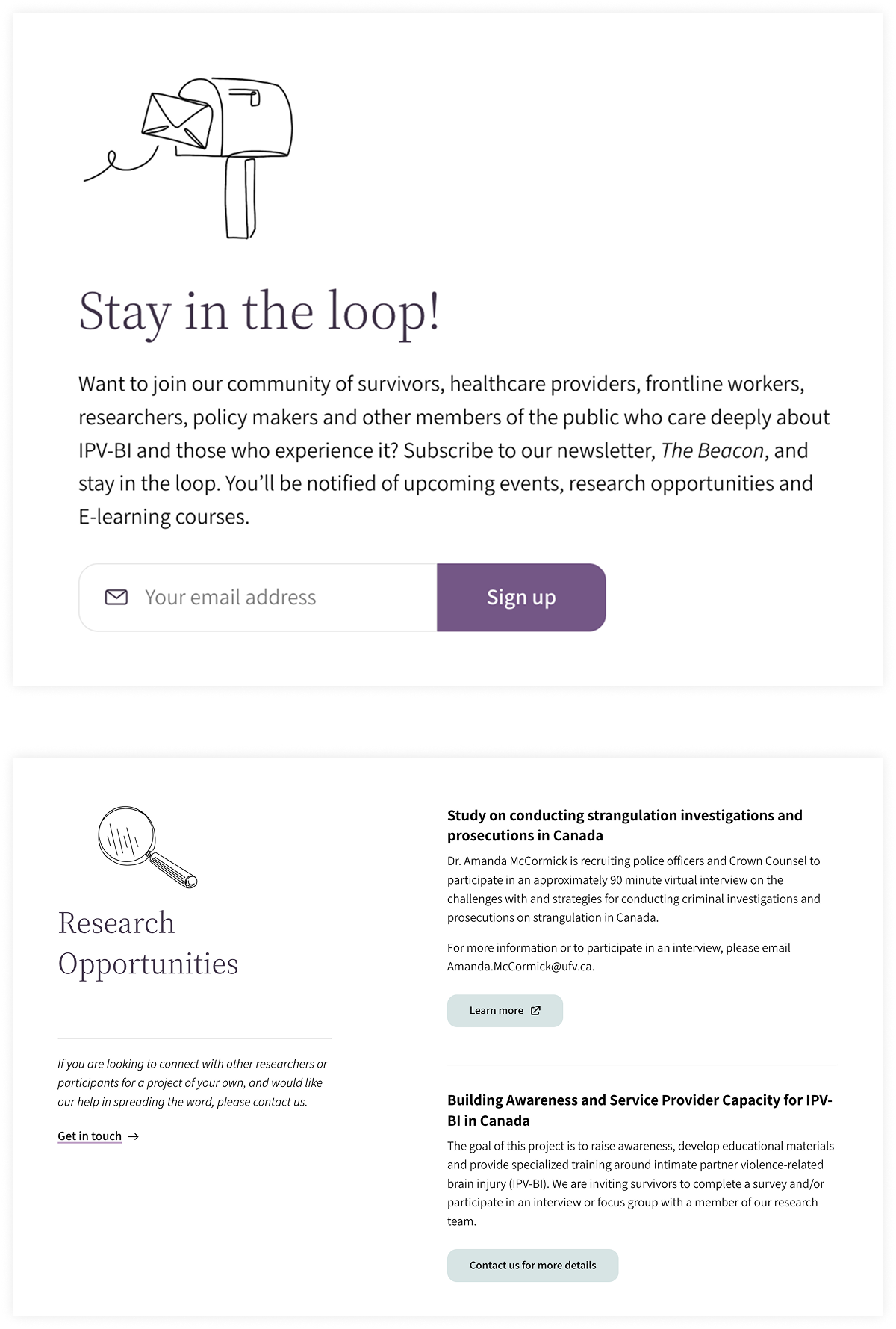
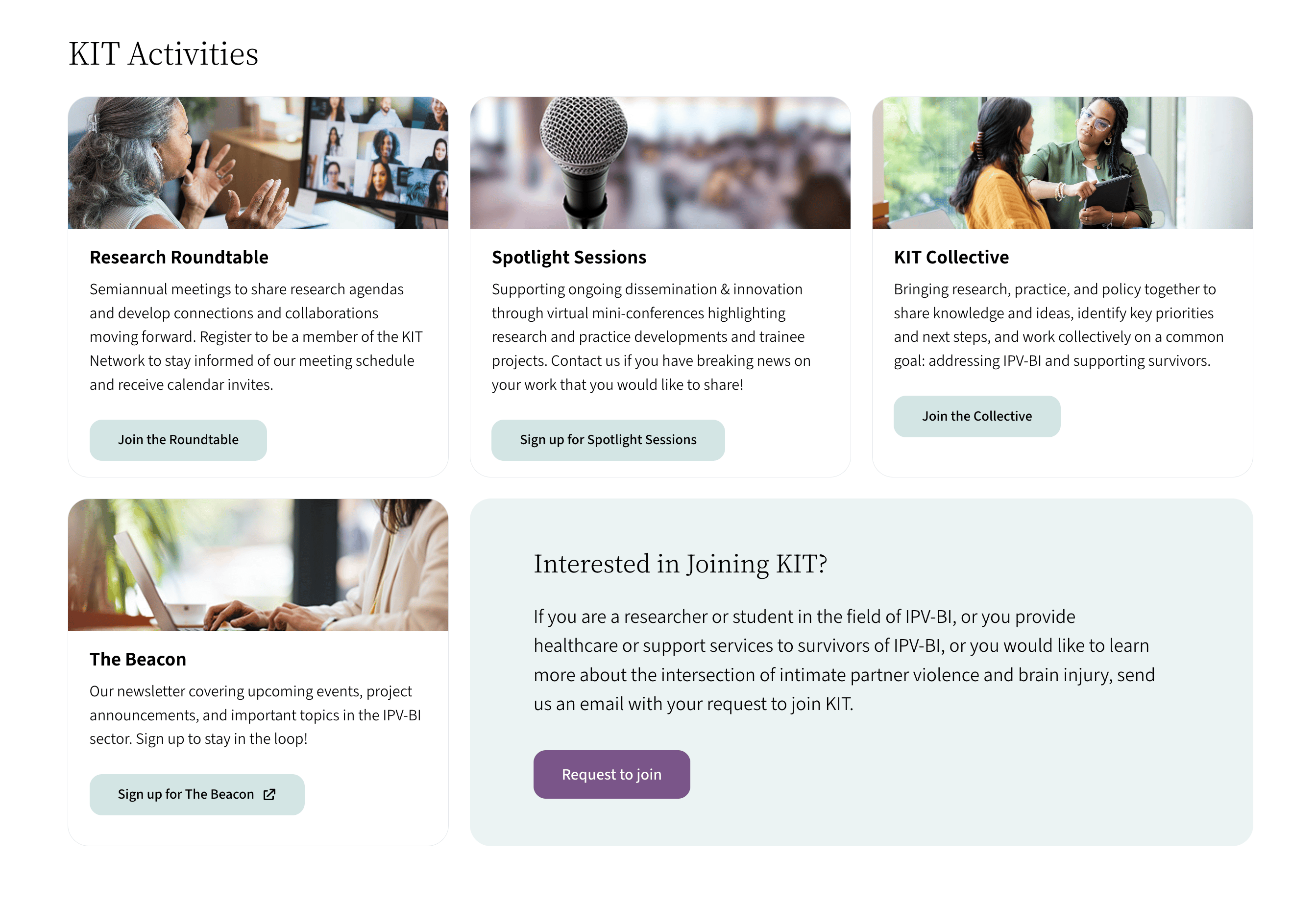
The result: invitations throughout the site to engage with existing activities, with no forum to moderate.
The Solution
What we built
Frontline workers book training or request a workshop for their team
Researchers join the KIT Network’s roundtables and spotlight sessions
Survivors find first-person stories and services, with safety tools always in reach
01
One hub, three audiences
The site had to serve three very different groups, so we designed entry points to help each visitor recognize themselves and navigate to relevant content easily.
02
Trauma-Informed Visuals
Knowing that some visitors would be survivors living with the effects of brain injury and trauma meant that the visual and UX choices needed to be trauma-informed. I initiated research so that we could adequately design with this mindset as well as for low cognitive load.
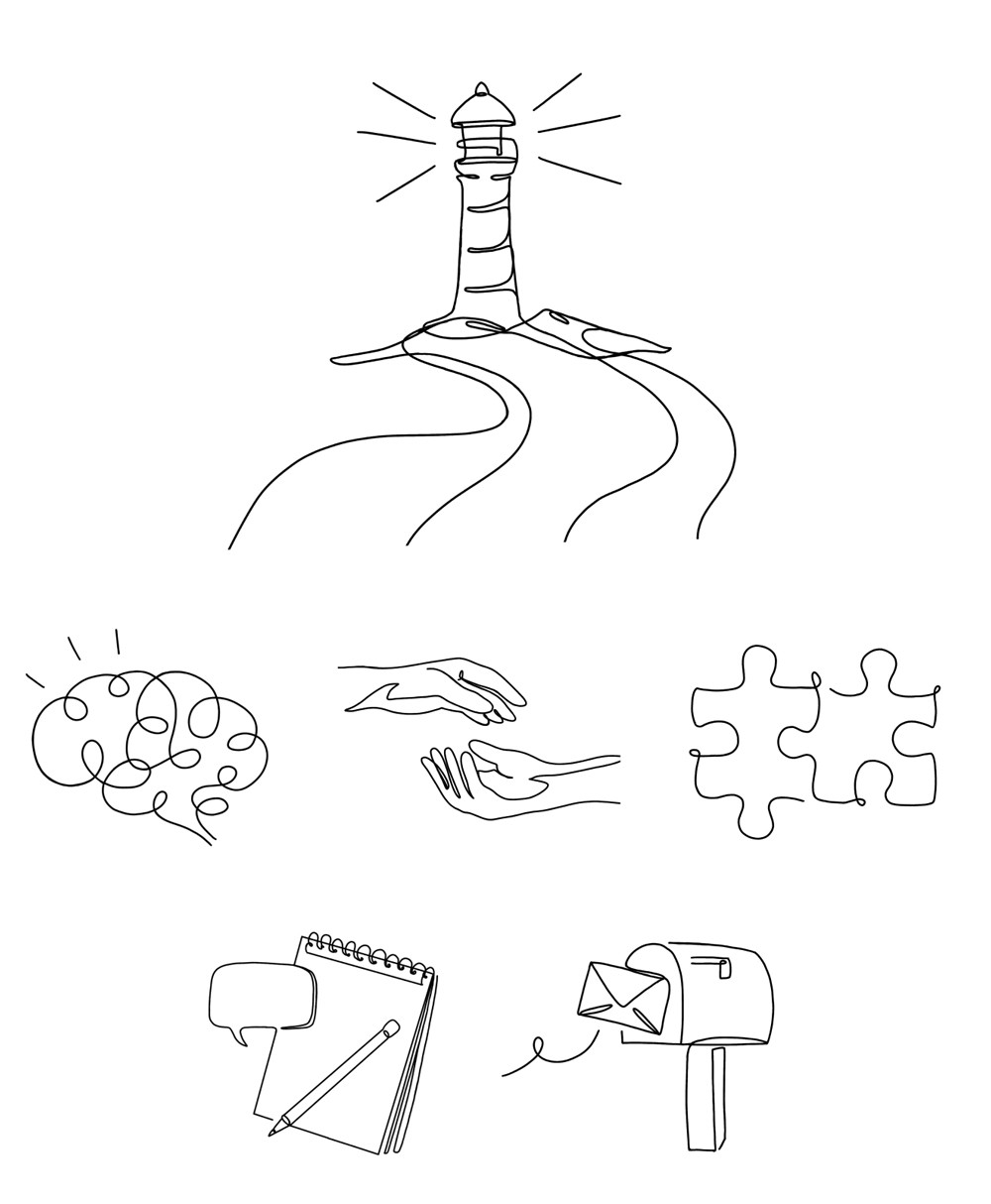
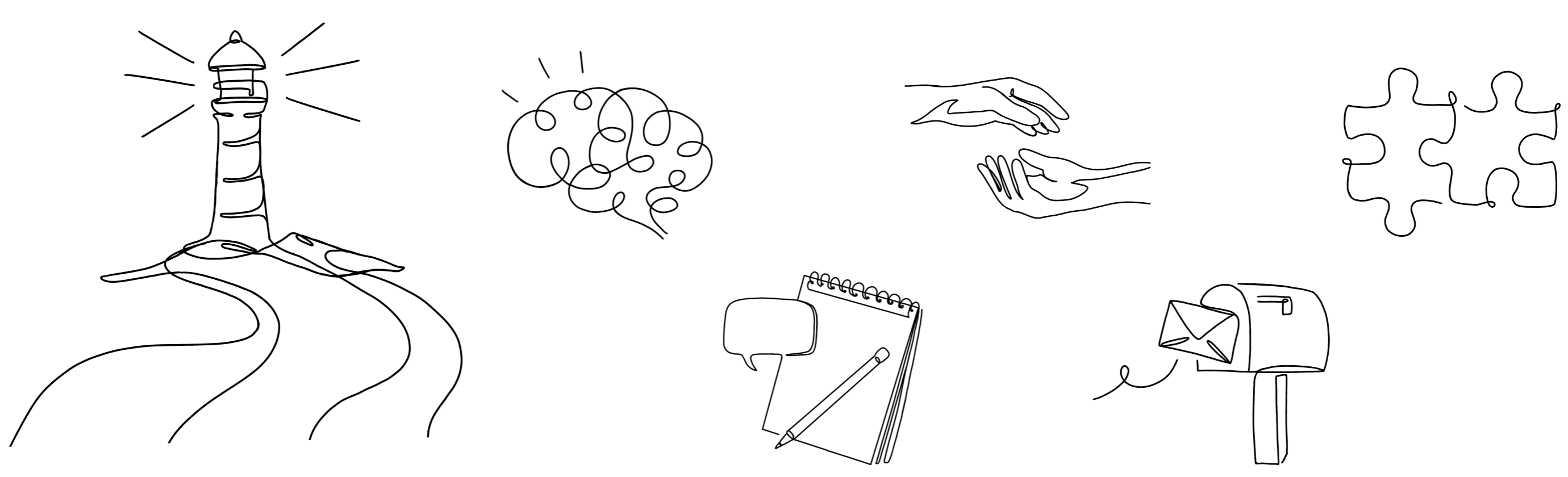
Illustrations became the site’s primary image style, in place of photography that could be too literal and potentially triggering. Metaphors like the lighthouse and a soft, hand-drawn style respect the gravity of the subject.
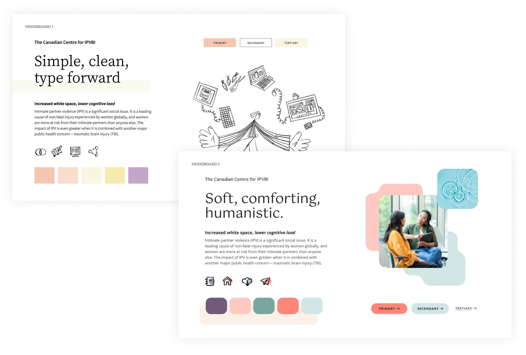
Moodboard directions explored soft palettes, generous white space and serif type to create a calm environment, reduce visual noise, and make content easier to absorb.
03
Keeping survivors safe
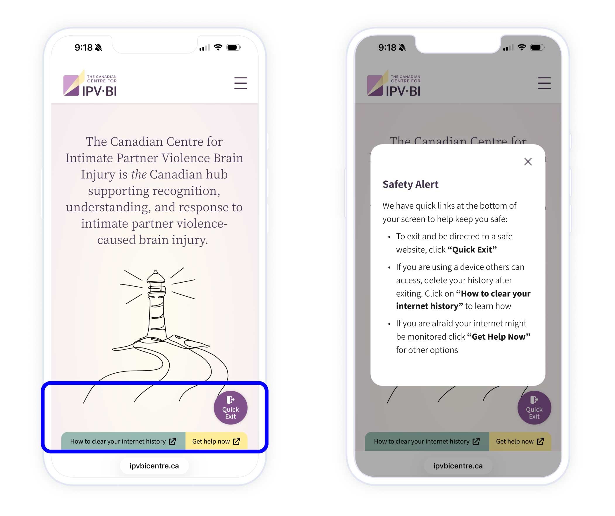
“Quick Exit,” “How to clear your internet history,” and “Get help now” buttons are a tap away on every page, placed in the bottom right corner for easy access on mobile. A safety alert modal appears for first-time visitors explaining the features.
Impact
Launched and in use across Canada
Awareness of IPV-related brain injury is still low, and the Centre is a small, modestly funded team with no marketing staff or social media presence.
Even so, the Centre launched in May 2026 with 400+ newsletter sign-ups already in place, which the client credited to our work on the brand, logo and messaging. In its first six months, more than 440 visitors from Vancouver to Montreal found the site with no paid promotion, and about six in ten visits were engaged.
When the resource library went live in October, it quickly became one of the site’s most-used pages. In its first four weeks it drew nearly as many visitors as the home page. People spent about a minute and a half there on average, and daily visits to the site roughly doubled.
440+ visitors
From Vancouver to Montreal in the first six months, with no paid promotion
6 in 10 visits engaged
Visitors stayed and explored, spending about 2¾ minutes on average
2× daily visitors
Since the resource library launched in October 2026
about me
Resumé
I’d love to hear from you!


© 2026 Brenda LittleMade with ❤️ in Canada
Building Canada’s National Hub for IPV-Related Brain Injury
Professionals working at the often unrecognized intersection of intimate partner violence and brain injury had nowhere to find shared resources, or each other. I led the design of a centralized, national website to serve as the much-needed resource hub and community network to fill those gaps.

Client • Studio
IPV-BI CentrePivot Design Group
Role
Lead UX & Visual Designer
Scope
Product strategy, Brand identity, IxD, UI design
Team
Two designers + one developer
Built to sustain
Community features sized to the reality of the client’s staff and budget
Trusted partner
Multiple projects with the project lead over 8 years
23,000+ users
Reached by the ABI Toolkit, an earlier project that made the case for the Centre—where I was also design lead
The Problem
A hidden crisis, with no place to gather.
Brain injury (BI) caused by intimate partner violence (IPV) often goes unrecognized. Resources were scattered and professionals had no network, so survivors weren’t getting the care they needed and research wasn’t moving forward.

01
Three very different audiences
Researchers, professionals working on the frontlines, and survivors each needed something different from one site.
02
An ambitious brief
The client wanted a moderated forum and a global directory of experts, but had no staff or budget to run them.
03
Users who may be in danger
Survivors might visit on a monitored device, so safety had to be built into every page.
The Approach
Defining the product
01
Starting from proven user needs
Having led the research and design on the ABI Toolkit, I was able to bring learnings forward from the survivor and frontline-worker personas and journey maps into this project, so we started from needs we’d already validated.
Survivor & front-line worker journey map from the ABI Toolkit
Comparing services to define the Centre’s value and purpose
02
Defining the value proposition
I mapped the Centre against partner organizations to identify where it offered value to its professional audience. Only the Centre could offer a community network, making this our guiding direction and also the hardest to deliver within the Centre’s budget.
03
Ambitious brief vs. operational reality
The initial brief called for an active online community featuring moderated forums and a "global Rolodex" of experts, requiring staff the client didn’t have, and in this field an unmoderated forum could be a real risk.
I proposed a “Bulletin Board” model instead. Dedicated pages showcase existing networks and recurring activities and invite people to join, so the site delivers community without live moderation.
The result: invitations throughout the site to engage with existing activities, with no forum to moderate.
The Solution
What we built
Frontline workers book training or request a workshop for their team
Researchers join the KIT Network’s roundtables and spotlight sessions
Survivors find first-person stories and services, with safety tools always in reach
01
One hub, three audiences
The site had to serve three very different groups, so we designed entry points to help each visitor recognize themselves and navigate to relevant content easily.
02
Trauma-Informed Visuals
Knowing that some visitors would be survivors living with the effects of brain injury and trauma meant that the visual and UX choices needed to be trauma-informed. I initiated research so that we could adequately design with this mindset as well as for low cognitive load.
Illustrations became the site’s primary image style, in place of photography that could be too literal and potentially triggering. Metaphors like the lighthouse and a soft, hand-drawn style respect the gravity of the subject.
Moodboard directions explored soft palettes, generous white space and serif type to create a calm environment, reduce visual noise, and make content easier to absorb.
03
Keeping survivors safe
“Quick Exit,” “How to clear your internet history,” and “Get help now” buttons are a tap away on every page, placed in the bottom right corner for easy access on mobile. A safety alert modal appears for first-time visitors explaining the features.
Impact
Launched and in use across Canada
Awareness of IPV-related brain injury is still low, and the Centre is a small, modestly funded team with no marketing staff or social media presence.
Even so, the Centre launched in May 2026 with 400+ newsletter sign-ups already in place, which the client credited to our work on the brand, logo and messaging. In its first six months, more than 440 visitors from Vancouver to Montreal found the site with no paid promotion, and about six in ten visits were engaged.
When the resource library went live in October, it quickly became one of the site’s most-used pages. In its first four weeks it drew nearly as many visitors as the home page. People spent about a minute and a half there on average, and daily visits to the site roughly doubled.
440+ visitors
From Vancouver to Montreal in the first six months, with no paid promotion
6 in 10 visits engaged
Visitors stayed and explored, spending about 2¾ minutes on average
2× daily visitors
Since the resource library launched in October 2026
about me
Resumé
I’d love to hear from you! Get in touch at


© 2026 Brenda Little | Made with ❤️ in Canada
Building Canada’s National Hub for IPV-Related Brain Injury
Professionals working at the often unrecognized intersection of intimate partner violence and brain injury had nowhere to find shared resources, or each other. I led the design of a centralized, national website to serve as the much-needed resource hub and community network to fill those gaps.

Client • Studio
IPV-BI Centre Pivot Design Group
Role
Lead UX & Visual Designer
Scope
Product strategy, Brand identity, Interaction design, UI design
Team
Two designers + one developer
Built to sustain
Community features sized to the reality of the client’s staff and budget
Trusted partner
Multiple projects with the project lead over 8 years
23,000+ users
Reached by the ABI Toolkit, an earlier project that made the case for the Centre—where I was also design lead
The Problem
A hidden crisis, with no place to gather.
Brain injury (BI) caused by intimate partner violence (IPV) often goes unrecognized. Resources were scattered and professionals had no network, so survivors weren’t getting the care they needed and research wasn’t moving forward.

01
Three very different audiences
Researchers, professionals working on the frontlines, and survivors each needed something different from one site.
02
An ambitious brief
The client wanted a moderated forum and a global directory of experts, but had no staff or budget to run them.
03
Users who may be in danger
Survivors might visit on a monitored device, so safety had to be built into every page.
The Approach
Defining the product
01
Starting from proven user needs
Having led the research and design on the ABI Toolkit, I was able to bring learnings forward from the survivor and frontline-worker personas and journey maps into this project, so we started from needs we’d already validated.
Survivor & front-line worker journey map from the ABI Toolkit
Comparing services to define the Centre’s value and purpose
02
Defining the value proposition
I mapped the Centre against partner organizations to identify where it offered value to its professional audience. Only the Centre could offer a community network, making this our guiding direction and also the hardest to deliver within the Centre’s budget.
03
Ambitious brief vs. operational reality
The initial brief called for an active online community featuring moderated forums and a "global Rolodex" of experts, requiring staff the client didn’t have, and in this field an unmoderated forum could be a real risk.
I proposed a “Bulletin Board” model instead. Dedicated pages showcase existing networks and recurring activities and invite people to join, so the site delivers community without live moderation.
The result: invitations throughout the site to engage with existing activities, with no forum to moderate.
The Solution
What we built
Frontline workers book training or request a workshop for their team
Researchers join the KIT Network’s roundtables and spotlight sessions
Survivors find first-person stories and services, with safety tools always in reach
01
One hub, three audiences
The site had to serve three very different groups, so we designed entry points to help each visitor recognize themselves and navigate to relevant content easily.
02
Trauma-Informed Visuals
Knowing that some visitors would be survivors living with the effects of brain injury and trauma meant that the visual and UX choices needed to be trauma-informed. I initiated research so that we could adequately design with this mindset as well as for low cognitive load.
Illustrations became the site’s primary image style, in place of photography that could be too literal and potentially triggering. Metaphors like the lighthouse and a soft, hand-drawn style respect the gravity of the subject.
Moodboard directions explored soft palettes, generous white space and serif type to create a calm environment, reduce visual noise, and make content easier to absorb.
03
Keeping survivors safe
“Quick Exit,” “How to clear your internet history,” and “Get help now” buttons are a tap away on every page, placed in the bottom right corner for easy access on mobile. A safety alert modal appears for first-time visitors explaining the features.
Impact
Launched and in use across Canada
Awareness of IPV-related brain injury is still low, and the Centre is a small, modestly funded team with no marketing staff or social media presence.
Even so, the Centre launched in May 2026 with 400+ newsletter sign-ups already in place, which the client credited to our work on the brand, logo and messaging. In its first six months, more than 440 visitors from Vancouver to Montreal found the site with no paid promotion, and about six in ten visits were engaged.
When the resource library went live in October, it quickly became one of the site’s most-used pages. In its first four weeks it drew nearly as many visitors as the home page. People spent about a minute and a half there on average, and daily visits to the site roughly doubled.
440+ visitors
From Vancouver to Montreal in the first six months, with no paid promotion
6 in 10 visits engaged
Visitors stayed and explored, spending about 2¾ minutes on average
2× daily visitors
Since the resource library launched in October 2026
I’d love to hear from you! Get in touch at


© 2026 Brenda Little | Made with ❤️ in Canada